
Bill Gardner wrote about concentration of NIH grants and possible risks. The worry is timely because, in negative NIH funding growth environments, concentration might increase. There’s definitely negative growth in NIH funding:

So the question then becomes whether fears of concentration are justified. Grantome, an organization that provides information about grants and other forms of research funding, used the following standard to try to answer this question: if the past proportion of R01 grants an organization receives is positively correlated with its three-year annual growth rate in R01 grants, we’ll say grant funding concentration is increasing. They produced this chart:

There’s some obvious correlation there, but also an obvious problem: instead of the past proportion of R01 grants, they used the “current” proportion. The issue here is possible reverse causality: it’s likely that organizations that have larger proportions now would have grown more quickly over the last three years, because otherwise how did they get so big?
This question matters for reasons Gardner is clear about and that I agree with. Using a Richard Florida map showing scientific citations per capita in a number of the world’s cities…

…Gardner quips “Post-war global science has been led by the US, but not really. It’s been dominated by Massachusetts, the Washington-NYC corridor, and California.” His concerns are:
First, increasing concentration of science on the coasts will increase US regional economic and educational disparities… Second, a greater concentration of scientific dominance in a few liberal states is to the disadvantage of the NIH, because over time it must further erode broad political support for medical science.
These both make intuitive sense to me. The only assumption behind these concerns is that Congressional representatives systematically vote for bills and budgets that send more funds to their own states and against bills and budgets that don’t, which, duh.
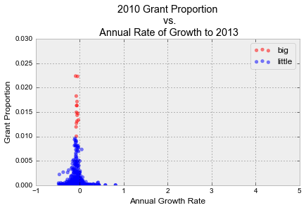
So it is a problem that grants are concentrated, but fortunately, they don’t appear to be getting more so. When I fixed the Grantome chart to look at proportion of grants held in 2010, the correlation vanished entirely. Instead, we had a nice funnel, showing diminishing variance but no drift as we increase the proportion of grants held. “Big” organizations are those with at least 1% of all R01 grants, “little” organizations are all others (with an arbitrary cutoff of 0.02%, because Grantome did that).
In fact, I checked each year’s proportion of grant’s held vs. three year annual growth rate in number of grants from 1986 to 2010, and that same funnel pattern was present in all of them:
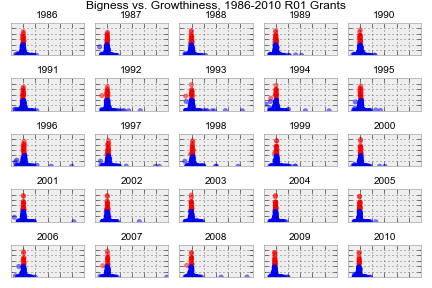 This says nothing about the current level of concentration, which is still scary for the reasons mentioned above, but at least grant funding concentration doesn’t appear to be getting worse.
(all code/datawork available on Github)
